Showing posts with label photoshop. Show all posts

Thursday, January 28, 2010

E-Stamping Tutorial

Stamps are fun, aren't they? Whether it's your monogram, motif or just for fun, it's pretty useful to have an easy way of transferring an image over. In the same way, it can also be useful to have an "e-stamp". Instead of importing or placing your image over and over while designing, you can just turn it into a stamp instead.

Once again, I'll be using Photoshop, but you can do similar things in the free program, GIMP if you don't have PS.

First, open up the image you want to make into a stamp. It's good to have a good resolution image that's fairly large, if you intend on making stamps of various sizes.
A good stamp has high contrast between black & white, and a clear definition around the image (i.e. no backgrounds!)

Now simply go to Edit -> Define Brush Preset and click okay. You can name your brush if you want.


That's it! Now let's go get that stamp/brush! (And open up a new document to "stamp on!")


Now just stamp away, in whatever color you like!

I turned the mons I designed earlier into stamps, so they are ready for instant use!

Try it out, let me know how it goes!

Tuesday, January 12, 2010

My Friend Gauss

You've all seen it. The soft, fuzzy picture of a couple in love. It conjures up a warm, happy, day-dreamy atmosphere, not to mention hides many a skin flaw.

Now you, too can create your very own soap-opera scene, lovey-dovies included. All thanks to my man, Gauss.

You see, Mr. Gauss was a smart guy, and he came up with a bunch of ideas to contribute to the world of math and science. One of his more well-known ideas looks a little like this:


Don't recognize it? How about we graph a couple out:


Bell curves! One of my least favorite grading methods.

Now what does math have to do with soap-opera fuzz?

Go grab an image and open it up in Photoshop (Most other editing programs can do this as well, so you can check with what you have! And there's always GIMP, the popular, free alternative). Duplicate the image.

With your duplication highlighted, go up to Filter -> Blur -> Gaussian Blur, and press okay.

Blurry, right? What you've just done is taken all your little photo pixels, and filtered them with Mr. Gauss's help. Sak, Peng-friend and I had a big long conversation on the exact way it works, but I think Peng-friend summed it up pretty well :

"The filter uses the equation, translates it so that the peak of the curve is at the orgin, revolves the graph to creat the contour, and then convolves it with the image (with each contour centered at a pixel). And the radius you set determines the variance (the sigma squared in the equation above)."


So that probably doesn't make all that much sense, but it doesn't matter anyway, since Photoshop does all the math for you! But if you do want a better explanation, you can start with the Wiki.


Now grab that opacity meter in your Layers (F7) window, and drag it down to your desired amount. I like 20%, usually.
There you have it - your own romantic glow!

And if you want to glow even more, set the blurry layer to "Overlay", for another neat effect!

Which would you rather see on daytime television?

Now show me what you got, and don't forget to thank Mr. Gauss for his superb equation!

Wednesday, January 6, 2010

DIY Photo Editing Tutorial

In my possession now are all the engagement photos we took! *claps hands excitedly* However, Mom-penga was a little stressed out at the idea of me posting her unedited pictures up on the internet. Now, I don't really want to wait for her to go through and fix them all (as we all know, this can take a while!), so I asked if I could fix them up instead.

"Sure...Just make sure you said that you did the editing, not me."

Of course Mom, I wouldn't want to taint your image. :)

So since photo editing is a relatively unexplored, new territory for me, I thought we could go through it together. Today we'll go through some of the basics. (There are many, many more complicated and professional methods, but the following will be good to start off with, I hope!)

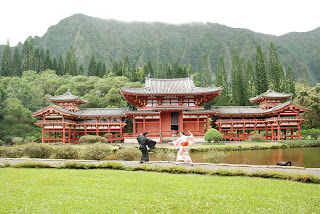
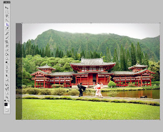
First, open up your photo (in this case one of my e-pic teasers) in Photoshop. It's a .jpeg below, but you're much better off working with .raw's if you have them. Mom-Penga only gave me the .jpegs, so it'll have to suffice.
Mortallll Kommmbaaattt!

Now let's play! Open the 
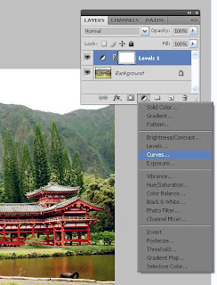
Layers window by pressing F7
(or Windows -> Layers)
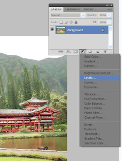
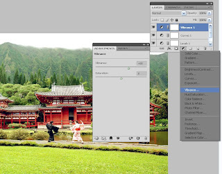
Press the little ying yang shape at the bottom of the window, which will cause the "Adjustment Layers" menu to drop down. All of these choices make some pretty cool effects, but for now let's stick with the "Levels" option. Click it open.
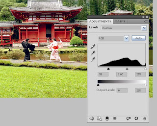
Slide the little triangles around beneath the graph to enhance the pixel brightness and darkness. The more you move the leftmost triangle to the right, the darker the colors become. Play around with it til you find something you like, in this case I just moved the leftmost triangle closer to the center. See how much more vibrant the colors are already?

Next adjustment layer - go back to your Layers window and select "Curves"

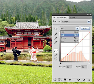
Levels, basically, help you adjust the color. You can do overall color by using "RGB", or individual set the reds, blues and greens. Adjust the image by clicking on the graph to move the color "curve". I tweaked the red and the green just a little bit, making them brighter.

For a finishing touch, I opened up a third adjustment layer, "Vibrance", and increased the color vibrance a little.

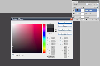
Now I want to polish this image up. Open up a fourth adjustment layer, "Solid Color" and pick a color. I used a dark grey, since I want a bit of a shadow around the edges.

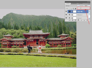
Now go to the Layers window and find the Opacity drop down. Decrease the percentage until you can see your image underneath, whatever your desired amount. I decreased my percentage to 25%. (This is the last adjustment layer I'll use for this picture, but there are many more - and they all do really cool things, so feel free to experiment! Then tell me what worked out the best!)

Now let's lighten up the middle. I grabbed the eraser tool, put it on a big, fuzzy brush, and just erased the parts I didn't want dark. (The program will ask you to "rasterize the fill" before allowing you to use the eraser. Just press "okay".)
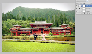
After wiping out the middle, now only the edges are dark, giving the picture a bit more depth.

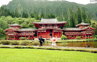
Lastly, I cropped the image a little on the left in order to have better symmetry.

Save, and you're done!

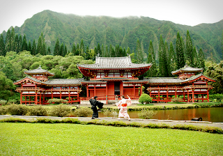
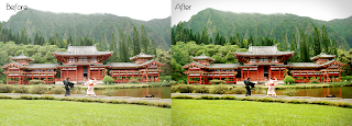
Think it was worth the effort? (Click the image to make it full size!)


(Next time, we'll do it the even easier way - "actions"!)

I know we all love a good edited picture - what's your favorite style? Matte pastels? Vintage? Bright and colorful? Black and white? (I love them all!)

Saturday, December 19, 2009

Penga's Quick and Dirty Line Art Tutorial

Ever have a hankering to make professional and fully custom motifs, designs, monograms, etc., all on your own? You too can create pretty, crispy lines like the ones floating around on my save-the-dates, program comics, and the pictures I've done for you, dear readers. Yes, I know you want to. Let's walk through it together!

Tools: I'll be using Adobe Photoshop CS2, but the method is more or less similar for other versions. You'll need a starting picture to vector over, some good music to jam to and your mouse-clicking hand. (Note: The following method is only one of many to create decent line-art. For me, this is one of the simpler and faster methods for PS. I understand there are far easier ways to do this in Illustrator, but unfortunately I don't have Illustrator ($$$$)! )

1) Open up the graphic you want to trace in photoshop. It can be a picture of a flower you like, someone's head, a drawing, whatever! I'll use a photo of a peony I found on wikipedia, and a sketch of one of my custom mons for our example. It doesn't matter what the image quality looks like at this point, just pull something up. (Note: click the images to make them larger!)


2)Now, in order to get a nice, clear crispy looking image, we'll want to use a high resolution. Go to Image -> Image Size, and use a big number. Typically, I'll use 300 pixels per inch for simple images, but if I'm really worried about quality, I'll up it to 600. Keep in mind that the higher resolution you use, the larger the file size will be, so be careful if you have computer memory limitations. After you change your resolution, your image may appear larger. No worries though, just zoom out until it's a normal looking size again.

3)Next, let's set up our working surface. If your "layers" window is not already visible on your screen, go to Windows -> Layers to pop it up. Now make a copy of your background image by right clicking the "Background" layer and copying it. Delete the original layer that has the symbol of a lock on it. We'll want to modify this image, so we don't want it locked.

4)Now let's pretend we're sticking a piece of tracing paper over the picture. Slide the opacity bar over to lighten your picture (mine is set to 50% in the image below). This will make it easier to see the new lines you're going to draw on top. (And if your pic is black and white - go to Image -> Adjustments -> Color Balance and change the color to something else. That way you can see your black lines when you trace over them. )

Once you change your opacity you'll notice that you can see through the image. You may want to add a blank white layer underneath the image layer for better visibility. Just use Layer -> New -> Layer to add another layer.

5)Add a new layer on top of the picture. Click on it to make sure the little paintbrush icon is highlighted. That means you're working on that layer. You don't want to end up tracing on top of your original image, since you won't be able to seperate the lines that way.

6)Now it's time to pick what kind of pen you'd like to trace with. You can play around with this until you find something you like, which can be fun since there's so many options (you can even make your own!). For now, I'll use a default pen setting ("Permanent Marker Medium Tip"). I changed the pen diameter to 5 pixels instead of 32, since I want fairly narrow lines.

7)Double check that you're still on the new empty tracing layer and then click the pen/vector tool. It looks like this:

8)Click first where you'd like to start your line, and click again to draw a segment. You can continue doing this for as many segments as you like.

If you click and hold, you can bend the line by moving your mouse around. That's how you get those clean curves.

Now, if your last segment was a curve, and you don't want to continue that curve, press and hold the "alt" button down and click the last point you made. This will allow you to continue making rounded segments as you please.

9)Once you're done drawing your segmented line, right click and pick "stroke path".

Then press "OK"

10) Now you should have your line. Right click the mouse again and say "delete path". The line is now complete!


11)If you want tapered ends, click "simulate pressure" button after going to "stroke path".


12) If you'd like to fill in a block of area instead of making a line, click "fill path" during step 9 instead of "stroke path".


8) Continue stroking lines and filling until you're finished!

9) Once done, delete or hide the starting background/image layer. You can hide a layer by clicking the little "eye" in the the layer window.

You can now save and use these images however you like. I resized mine down to a smaller pixel size (not smaller pixel per inch size!) and saved as a .jpeg.


Easy no? Now I have a pretty peony to stick on some wedding stationery of some sort. :)

Show me what you can do! Or share your own tips and tricks if you're already a pro!

Thursday, July 30, 2009

Save the Dates Phase 1

'Save the Date' cards are what most people do if they decide to do anything 'DIY'. So naturally, I will be making my own as well. I decided to draw mine. Not that I'm an expert or anything, but it's been a long hobby of mine, and you know, it's just plain cuter than the real Saka and Penga.

Hard at work!

Above is the main image we'll be using. The plan is to turn these into little 2x3" magnets from Vista Print, attach them to some kind of card, and mail away! However, we have yet to decide on a suitable background. What's simple, but not too simple? Mom-Peng & Sister-Peng made me a version with a Mario Bros. scene in the background (us jumping into a pipe and everything!). Unfortunately, I'm thinking that my images aren't "pixelly" enough to vibe with the 8-bit feel of an old-school game.

As for the wording, it will definitely include something along the lines of "Saka and Penga are advancing the storyline", since the pic is a light reference to our love of RPGs (role playing games). Kicking off our first project sure is exciting!

If you're doing them at all, did you do anything on the unconventional side for your save-the-dates?